Saturday, November 19, 2011
How presenters waste your time with confusing graphics
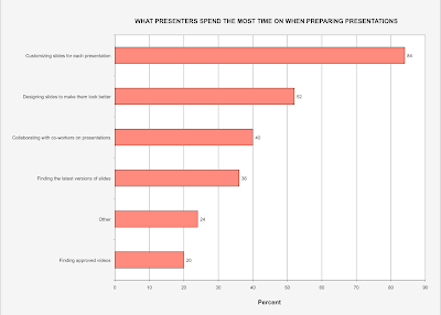
The Excel bar chart shown above plots some data from an October 26th Presentation Agency blog post from Sales Graphics titled survey data reveals how presenters spend their time. (Click on the chart for a larger, clearer version). We can easily see how the six categories rank, because they are listed in descending order.
Contrast that with the confusing graphic shown in the Presentation Agency blog post. It seems intended to impress rather than to explain. The six categories are wrapped in concentric rings like a bullseye target. The largest is on the outside, followed by the second, and the sixth. Then comes the third, fourth and fifth. We have to look at all six percentages and sort them to see their rank. We can’t just go clockwise or counterclockwise to see their order.
Now look at the inconsistent caption boxes. The first word in four out of six categories is shown in a bold font. The box with 40% has two of five icons (men) shown in bold, but the box with 20% also has two of five icons (stars) shown in bold, rather than just one. One paragraph in the blog post starts by saying that:
“A full 56% of survey takers said finding the latest version of slides and videos sucked up a lot of time...”
If that’s what you want to say, then please change how you group the data on the graphic to present it to us clearly and simply (as shown above). Now "Other" is the smallest category.
A November 8th Slidecoaching.com blog post discusses choosing the best charts for your data. I don’t think a fancy bullseye bar chart beats a plain one. What do you think?
Subscribe to:
Post Comments (Atom)


No comments:
Post a Comment